 |
|
|
#1 |
|
Vikingsword Staff
Join Date: Dec 2004
Location: The Aussie Bush
Posts: 4,714
|
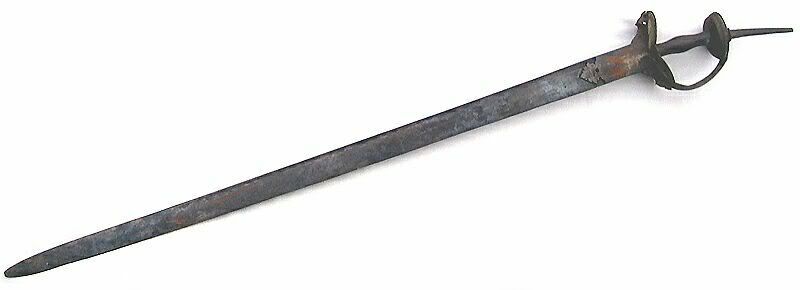
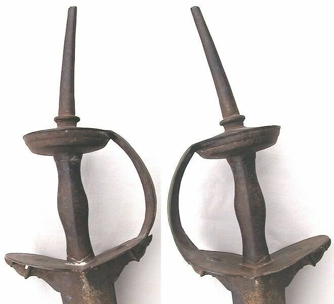
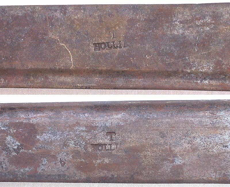
I have had this one for some time and it is in the original state that I received it. It has a traditional Indian basket hilt and a long straight blade on which is stamped a letter "T" over a name "HOLLI.." I have been unable to find a maker that corresponds to this mark. Anyone have suggestions?
Any idea of when this sword was made? Here is an overall view of the sword:  The Indian basket hilt:  And the markings on the blade:  Ian. |
|
|

|
|
|
#2 |
|
Member
Join Date: Dec 2004
Location: Houston, TX, USA
Posts: 1,254
|
On the second closeup the name seems to be "Hollu", rather than "Holli" The "typeface" of the letters may help you date the blade?
|
|
|

|
|
|
#3 |
|
Member
Join Date: Feb 2005
Location: Clearwater, Florida
Posts: 371
|
The lettering on the blade definitely isn't Indian, making it an official "firengi" or foriegner....I can't watch Star Trek any longer without grinning each time the word is used!
That's a beautiful old sword, so you can consider me officially envious on it as well. Mike |
|
|

|
|
|
#4 |
|
Member
Join Date: Dec 2004
Location: Houston, TX, USA
Posts: 1,254
|
Yeah, and how about Jem Haddar? (I don't know how to spell that, don't claim to, and even don't want to)

|
|
|

|
|
|
#5 |
|
Member
Join Date: Feb 2005
Location: Clearwater, Florida
Posts: 371
|
LOL!
Star Trek came by it honestly, with the "Dune" series of novels by Frank Herbert showing just how alien a culture can be, right here on earth, with very few changes being necessary to make it fit another galaxy, far, far away, from a Jihad right on down. Mike |
|
|

|
|
|
#6 |
|
Member
Join Date: Dec 2004
Location: Europe
Posts: 2,718
|
I doubt very much, that anyone with knowledge of typefaces would try a guess, and if someone did, the answer would be very vague, and therefore of little or no use. Maybe, if the letters were regarded as a logo, a result can be reached, but this would mean books with European factory stamps anyone volunteer?
Ian, on the top picture where you show the two stamps, it seems as if the edge is hollow. Is it, or does it only look so to me? If it is, this could be of some help too, if we bring in the forum specialists on European blades. Nice Firangi - when you get it cleaned  . .Jens |
|
|

|
|
|
#7 |
|
Member
Join Date: Dec 2004
Location: Houston, TX, USA
Posts: 1,254
|
Pretty sure that's the spine, with a groove running beside it, that those are pictures of both sides of the blade, and that both are marked?
|
|
|

|
|
|
#8 |
|
Member
Join Date: Dec 2004
Location: Europe
Posts: 2,718
|
Hi Tom, you may very well be right, but then, why don't you see the fuller on the other picture? I agree that this counts for the edge too
 . .Jens |
|
|

|
|
|
#9 |
|
Vikingsword Staff
Join Date: Nov 2004
Posts: 6,418
|
Hi Jens , I think it may be a matter of lighting that makes the fuller on the other side hard to distinguish .
|
|
|

|
|
|
#10 |
|
Vikingsword Staff
Join Date: Dec 2004
Location: The Aussie Bush
Posts: 4,714
|
Jens:
There is a narrow fuller running along the back of the blade on each side. In the bottom picture above, showing the marks, the top view has the edge to the top of the picture and the bottom view has the edge to the bottom of the picture. Which means the maker's name was stamped upside down in the top view -- looks sloppy to me. I imagine this was produced by a stamping tool which was used on one side and then the blade was turned over to stamp the other side. Perhaps this speaks to a degree of mechanisation of the blade manufacturing process. Could this have been a European trade blade that was produced in some quantity for the Indian market? BTW the type face looks very close to an English font called Caslon Old Style (dating from 1725), one of the Venetian family of fonts used by early printers. In particular, the serifs on the "T" and "L" suggest Caslon Old Style. See: http://graphicdesign.sfcc.spokane.cc...s.htm#oldstyle Ian. Last edited by Ian; 25th March 2005 at 05:51 PM. |
|
|

|
|
|
#11 |
|
Member
Join Date: Dec 2004
Location: Europe
Posts: 2,718
|
Ian, it could be Caslon, but it could also be a lot of other typefaces, but lets say it is Caslon, and dig something out about this typeface. Until the beginning of the 18th century the English got their types from Holland, either by buying the types directly or by buying the matrixes and cast the types themselves. The first typecasting firm in England was started in 1720 by William Caslon, his typeface was used a lot until the empire typefaces started to take over.
If this is correct we start looking for blades after 1720-30. Unfortunately I only have one book on European military weapons, and that is one on Danish swords, but I guess the types used in Europe at that time were more or less the same. In this book there are two swords with blades like the one you show. The first one is rather early if the typeface is correct, it is a sword for the foot soldiers, model 1710, but the other one sounds more promising, a sword for the cavalry model 1780, so maybe it is from the time 1750-1850, you should start to look for a factory making swords, which used this mark or maybe the mark was faked, like so many others, but I hope not. Jens |
|
|

|
|
|
#12 |
|
Member
Join Date: Dec 2004
Location: What is still UK
Posts: 5,988
|
I have seen today through my PC, a firangi hilted mace for sale.Oddly it has the same complete overall rather uniform dry rust with no sign of previous care or use.None of the rust seems to have bit deeply for such a supposedly old blade.Am I just a suspisious old man?Tim
Last edited by Tim Simmons; 25th March 2005 at 09:59 PM. |
|
|

|
|
|
#13 |
|
Member
Join Date: Dec 2004
Location: Europe
Posts: 2,718
|
Besides, if the type face is Caslon, this would most likely mean, that the blade is English, but there can be several other possibilities, like French, German, Italian, Spanish and most likely a few others.
Jens |
|
|

|
|
|
#14 |
|
Member
Join Date: Dec 2004
Location: Houston, TX, USA
Posts: 1,254
|
Seems there was an English (?) cutler "T Hollister" whose tools I've seen?
|
|
|

|
|
|
#15 |
|
Vikingsword Staff
Join Date: Dec 2004
Location: The Aussie Bush
Posts: 4,714
|
I posted this one over on the SFI military forum and one of the members there gave me a good lead on Thomas Hollier.I have since found that Thomas Hollier operated an amoury for the British Board of Ordinance in Lewisham from 1716-1753. There is a brief historical note here: http://gihs.gold.ac.uk/gihs19.html
Seems like a good candidate for manufacture of the blade above -- the time period would fit with the type style on the blade (probably Caslon Old Style, dating from 1725). Putting this together, I would estimate the blade was made between 1725 and 1753, so an approximate date of circa 1750 would be a reasonable guess within 10-20 years.  Ian |
|
|

|
|
|
#16 |
|
Member
Join Date: Dec 2004
Location: What is still UK
Posts: 5,988
|
Jolly good.
 Tim Tim
|
|
|

|
 |
|
|